By providing your information, you agree to our Terms of Use and our Privacy Policy. We use vendors that may also process your information to help provide our services. This site is protected by reCAPTCHA Enterprise and the Google Privacy Policy and Terms of Service apply.
Here Are the Best Indie Posters of 2014…So Far

With more independent films than ever flooding the marketplace, it takes one hell of a marketing campaign for a project to stand out. Solid trailers, positive reviews and dependable talent in front of and behind the camera certainly play a huge role in getting word out to as wide an audience as possible, but a striking, unforgettable poster can be the marketing tool that makes a movie too intriguing to miss. 2014 has been a strong year for independent movies and the only thing as memorable as the films themselves has been their effective posters. As we head into the second half of the year, we look back and pick the best indie posters of 2014 so far.
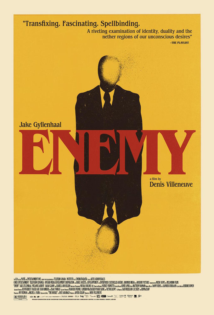
Best Poster Art for the Same Film: “Enemy” and “Under the Skin“
A24 really pulled out all the stops in marketing Denis Villenueve’s heady thriller “Enemy” and Jonathan Glazer’s long-awaited sci-fi stunner “Under the Skin,” releasing a slew of gorgeous posters for each film. The films, both visually arresting works, get the treatment they deserve with images that highlight this very component.



 Best Art Direction: “The Grand Budapest Hotel” and “Hateship Loveship”
Wes Anderson’s “The Grand Budapest Hotel” is art directed to the max. Fox Searchlight’s poster for the film does total justice to Anderson’s fastidiously crafted vision. While IFC’s drama “Hateship Loveship” is a more conventional looking indie, the poster for the film transfixes with its understated, dreamy color scheme and the way star Kristin Wiig’s dress melds into the wallpaper that frames her, almost like a more delicate version of the same image from Zach Braff’s “Garden State.”

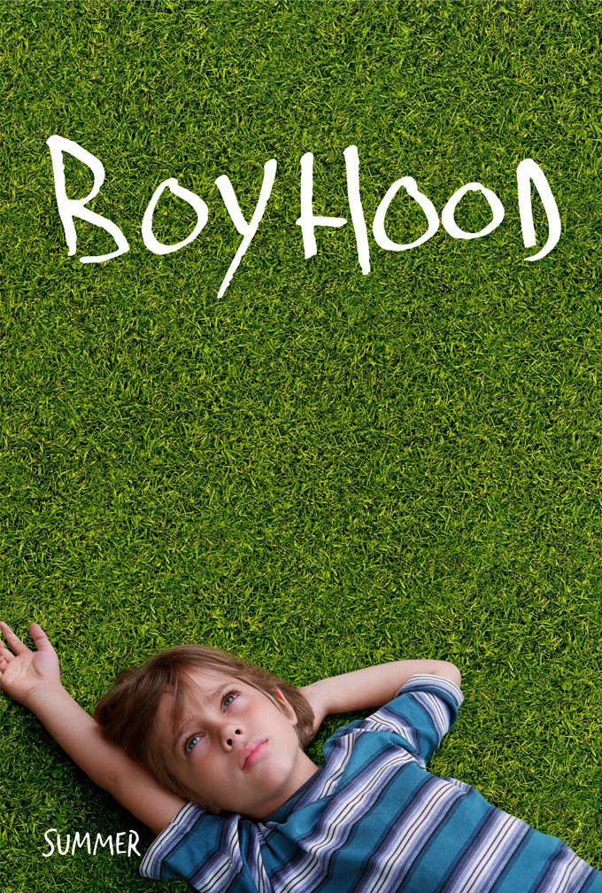
 Strongest Use of Minimalism: “Interior. Leather Bar.” and “Boyhood”
The poster for Richard Linklater’s epic, 12-year undertaking is a still of the initial shot of the film. A young Ellar Coltrane lies in the grass, contemplating the mysteries of life. It is a shot so simplistic in its universality, that we can almost all remember a time when we were a child and sat back in quiet reflection of the world around us. Even more simplistic is the art for James Franco and Travis Mathews’ “Interior. Leather Bar.” The black poster seemingly tells you nothing about the film, but since the plot attempts to recreate the lost 40 minutes of William Friedkin’s controversial “Cruising,” the image is a subversively bold comment on censorship.

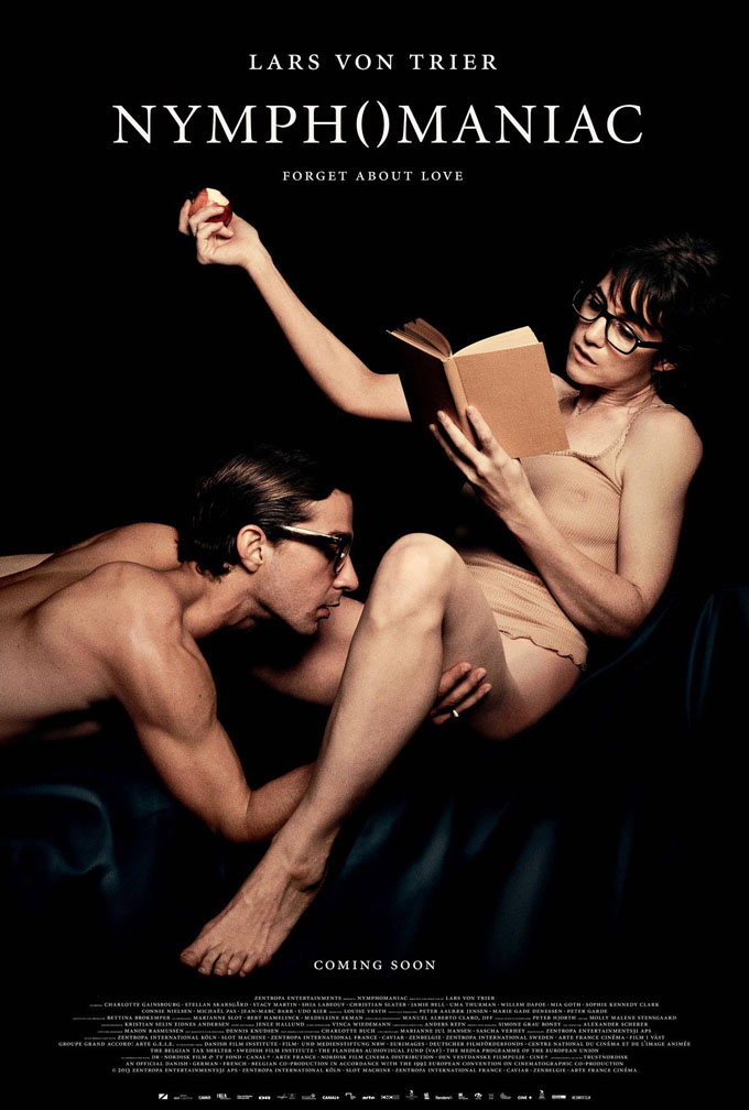
Most Provocative: “Nymphomaniac“
The marketing team behind Lars von Trier’s latest had their work cut out for them given the filmmaker has gone on record to say that he will no longer talk to the press following his controversial remarks at the Cannes press conference for “Melancholia.” Instead of cowering away from the challenge, they pulled out all the stops with an expertly calibrated marketing blitz that was impossible to ignore earlier this year. First came the below teaser poster that said so much with so little. When the genius character posters were revealed, “Nymphomaniac” made headlines all over the world. No matter what you make of the Danish auteur, there’s no denying the provocative allure of these posters.


 Trippiest Poster: “The Signal“
For William Eubank’s cavernous, Kurbrick-esque sci-fi thriller, Focus released this visually challenging poster, also quite Kubrickian. Once your eyes get lost in the telescoping layers of the image, drawn into an ambiguous hallway with the specter of the film, Laurence Fishburne’s haunting doctor, it is easy to get lost in the strangely repeated details. So, R U agitated?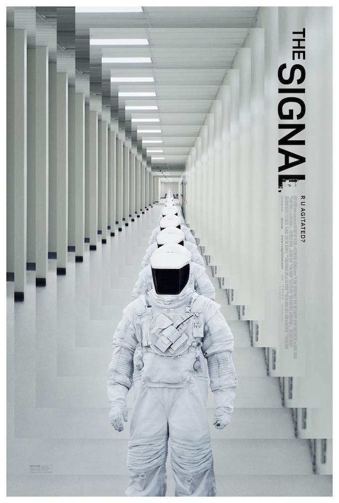 Most Innovative: “Foxcatcher” and “Willow Creek”
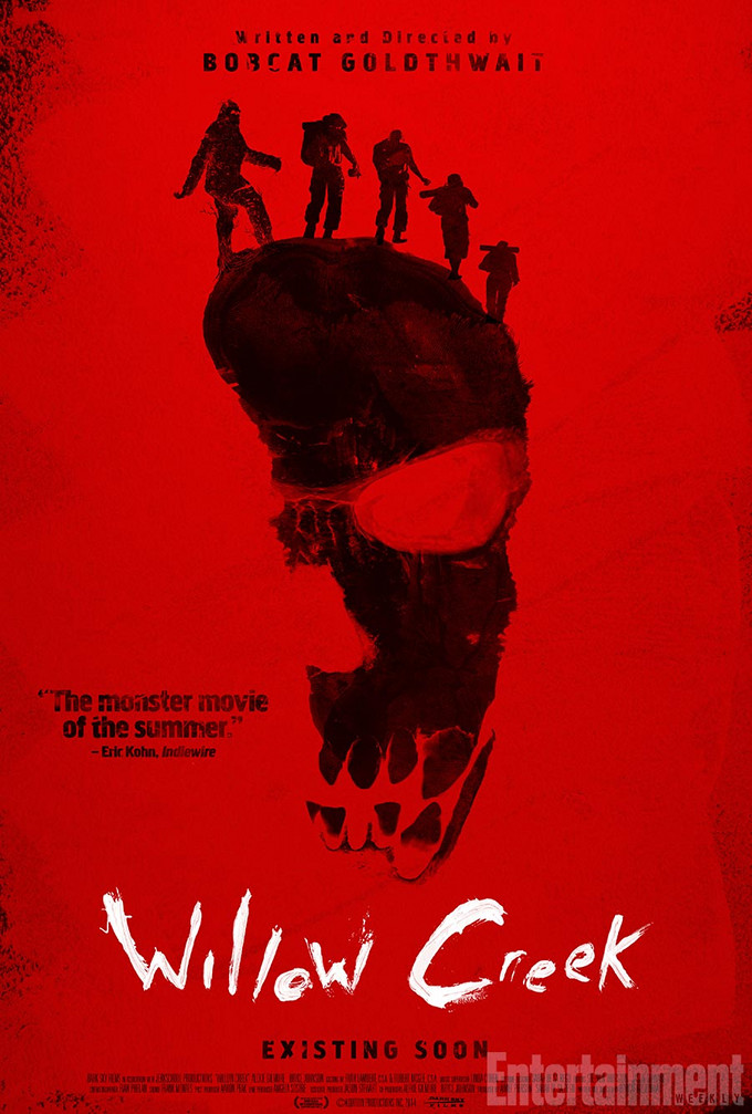
Sony Pictures Classics’ eery poster for “Foxcatcher” perfectly reflects the film’s silently threatening ambiance and ominous tone. Steve Carell’s silhouette, prosthetic nose and all, is reminiscent of an old, ceramic bust that you would find in an affluent mansion. A mansion not unlike the one which appears within the silhouette, which is in turn, reminiscent of the du Pont family’s enormous mansion. Similarly, Dark Sky Films went for some creepy undertones with its poster for Bobcat Goldthwait’s “Willow Creek.” Is it a footprint? Is it a skull? Are those humans walking across the top? Or something more sinister?

 Best Use of Color: “The Face of Love” and “Palo Alto“
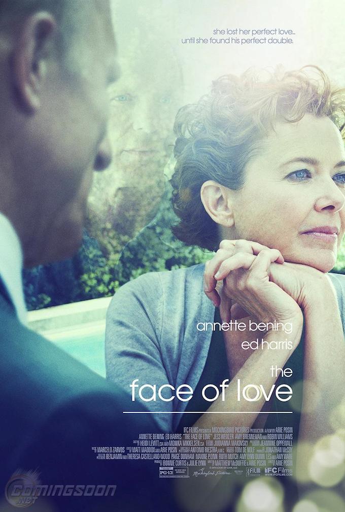
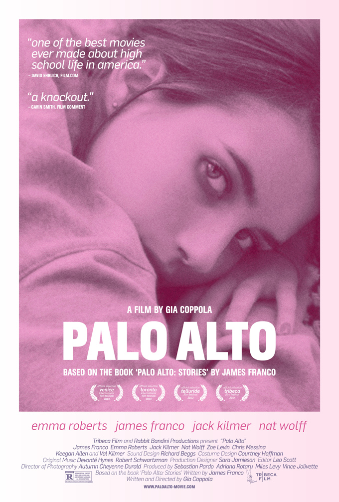
A close up of a beautiful Emma Roberts, this poster for “Palo Alto” graciously applies a monochromatic scheme to the same effectiveness as last year’s similar poster for “Frances Ha.” Two character studies about burgeoning young women, both posters capture the innocence with which April is cloaked at the beginning of the film. The soft pink pallet triggers a response true to the film’s sentimental storyline. Just as insightful to the movie’s storyline but a bit more ethereal is the poster for Arie Posin’s “The Face Of Love,” featuring Ed Harris, Annette Benning, and Ed Harris. The image cleverly presents the two love interests, but does so with a faint, unfocused blend of shades that evoke a sensation of just enough fantasy to unite it with the mind-bending film.
 [Editors’ Note: Casey Cipriani, Brandon Latham, Zach Sharf and Nigel M Smith contributed to this article.]
By providing your information, you agree to our Terms of Use and our Privacy Policy. We use vendors that may also process your information to help provide our services. This site is protected by reCAPTCHA Enterprise and the Google Privacy Policy and Terms of Service apply.


